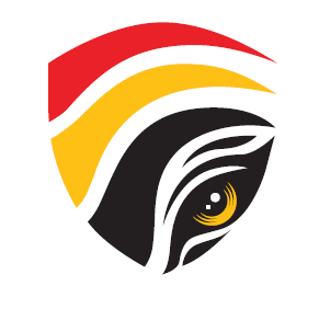
The design of this logo is a visual evolution of the original logo transitioning from three tiger claws to a tiger’s eye, symbolising sharp vision, continuous monitoring, and heightened vigilance. This transformation reflects EAIC’s expanding role in proactively reinforcing integrity and accountability. While the logo has evolved, it retains the key visual elements introduced since the estabishment of EAIC in 2011, ensuring a strong and recognisable corporate identity.
TYPOGRAPHY
Modern and firm to reflect a professional, authoritative, and credible image.
| RED | YELLOW | BLACK |
|---|---|---|
| Courage and Firmness | Integrity and Justice | Transparency and authority |
| SYMBOL | DESCRIPTION |
|---|---|
 |
TIGER’S CLAW
The sharp curves in red, yellow, and black, resembling a tiger’s claw. It represent courage, strength, and a sense of protection. |
 |
TIGER’S EYE
A symbol of firmness, sharp observation, and transparency in monitoring the integrity of enforcement agencies. |
 |
SHIELD
The arrangement of the tiger's claws and tiger's eye forms the shape of a shield, symbolising EAIC’s role as a protective barrier for enforcement agencies and the general public in upholding accountability and integrity. |


